Admit.me’s New Look Part 1: Homepage

Boring. Confusing. Bland. Just a few of the words to describe the previous Admit.me home page. You users can be brutally honest! Well, we heard you and we did something about it. We enlisted our awesome design team led by Kofi, Hypatia, Eunhae, Erica, and Jaime to get feedback. Here’s a bit about the evolution of the Admit.me homepage.
What was our process?
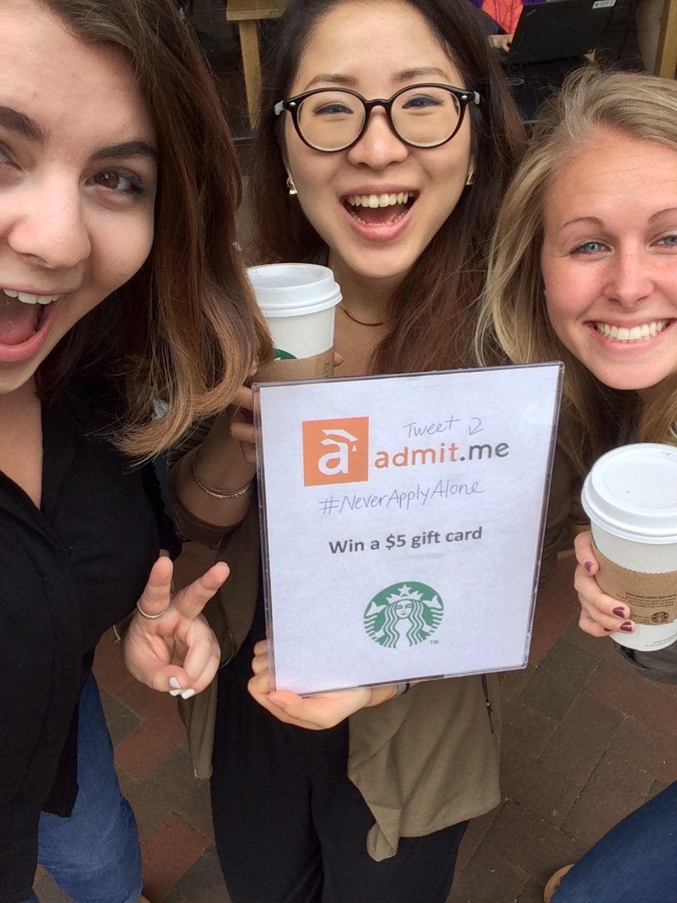
Sure, we did some A/B testing on our home page and sent out some surveys. However, the real insights came from old fashion live user testing. We went out to cafes and sat down with our target market: college and graduate school applicants. Our new hack is to find open campuses and park at the closest lunch spot – it works! We also went to a few college fairs and sat down with a few applicants and got feedback in exchange for application guidance (imagine that, a win-win).
Admit.me crew ready to roll!
What did we find?
What the heck is Admit.me? Some of you told us that you didn’t know what we did (that’s rather important), so we knew clarity of our mission was priority #1.
You want to test it first: We heard that you may want to try out the site before committing to building a profile, so we added a section for you to ask a question directly on the home page.
Keep the good stuff: People like to be able to play around with the site by clicking on user profiles, viewing the forums and subscribing to the newsletter. Everyone likes to window shop!
Improve registration: We’re working hard to improve our registration process. Look out for our new, sleek, user-friendly registration wizard.

OK. Maybe not THIS wizard. (Source: Giphy)
How did we do it?
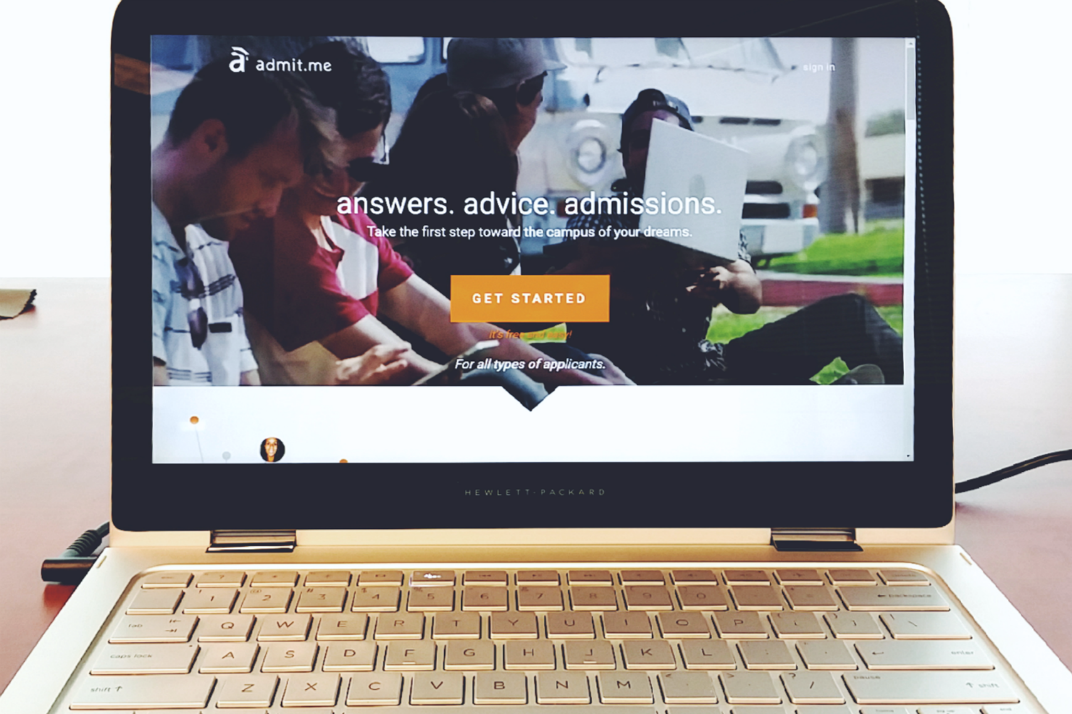
We tried several versions using A/B testing and settled on the version that we launched today. We’ve added a few cool features. Check it out here.
- Scrolling video at the top that we (humbly) believe makes the site more engaging
- Clearly defined Admit.me’s mission statement and value proposition
- Added an Ask a Question section that actually goes to the ask a question forum and will be answered (try it)
- Expanded the view to full screen (previously had borders)
- Kept the scrolling user team photos (favorite on the previous page)
- Added clear action steps for a newsletter and getting started
Thanks to you and the Admit.me team for making the new home page a success! Thanks again for joining our mission to make college access for all.
P.S. We want to hear what you think of our new homepage! Shoot us a message at hello@admit.me. Also, look out of our mini poll on the website.
Eunhae Lee
Get more admissions help at admit.me


Leave a Reply
Be the First to Comment!